Magnetic Maven (Conceptual Project)
Magnetic Maven exists to empower ambitious female entrepreneurs to scale their businesses through increased visibility in their digital marketing.
Conceptual brand design, logo design, web design.
Personal projects, or conceptual designs, are one of our favorite ways to stretch our creative muscles and explore new styles or industries we’re curious to design for. While not being a real-life client of ours, we wanted to imagine what an unapologetic, electric, and engaging design for a bold visibility coach might look like.
Strategy
The concept behind the Magnetic Maven brand was a bold, unapologetic approach to marketing and visibility. Imagine if the wild and zany childhood best friend from every ‘90s- and ‘00s movie grew up to become a high-earning “girl boss” who’s now teaching others to follow in her footsteps: that’s who the Magnetic Maven is.
The challenge of the strategy was to dig deep enough into the real need the brand would solve for its audience, which at the core is a self-confidence issue. Female entrepreneurs are often carrying over narratives they heard in their professional career before launching their new ventures: “Don’t be too loud; just do your job quietly; don’t make a ruckus”. Further, earnings can be a self-worth issue (and while it shouldn’t be, it still is)—the less you earn, the less confident you feel, and the less likely you are to feel inspired and empowered to put yourself and your business out there.
The inspiration behind the brand strategy, then, was to dig our heels into the topics of self-confidence and giving the audience permission to be loud, to raise their voice, and be visible. You can’t earn more money if you’re not visible; you can’t be visible if you’re not raising your voice; and you can’t raise your voice if you don’t have the confidence to shout.
So much like a loud, wacky best friend (who’s also a high-earning professional), Magnetic Maven is here to embolden and inspire female entrepreneurs to scale their businesses through increased visibility in their digital marketing—starting from the inside out by tackling their self-confidence first.
Brand Visual Identity Design
From our strategy, we decided that the brand’s core descriptors should be BOLD, UNAPOLOGETIC, ELECTRIC, MAGNETIZING, and ENERGIZING.
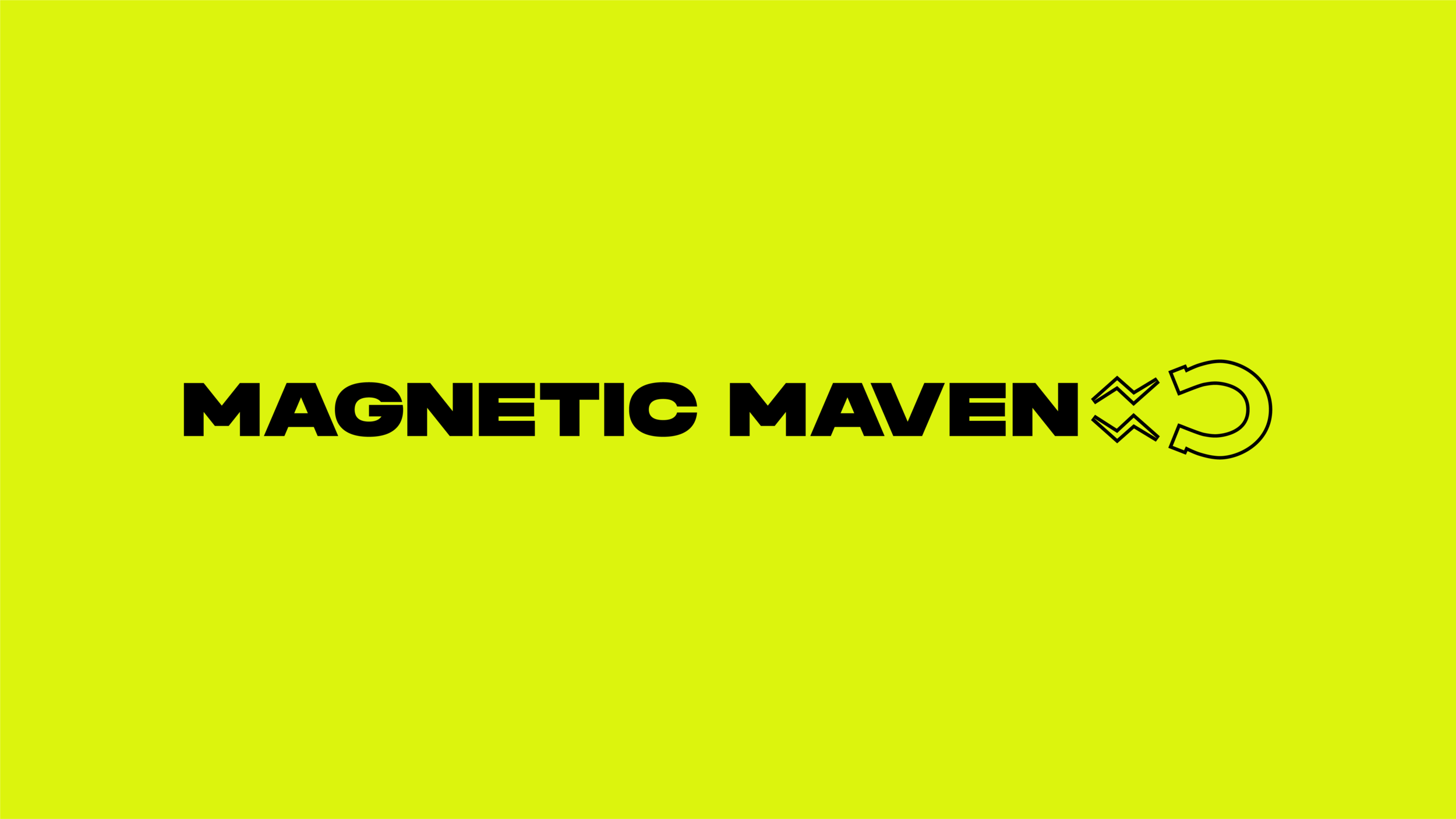
The brand visual identity design is all of those words (and then some!). We settled on a strong color palette of electric neons, solid black, and a supercharged purple (which is the direct inverse of our neon green) for warmth and contrast. The pairing of black with neon evokes imagery of lightning and electricity—elements which directly carry over into the logo design.
We played around with the typography of “Magnetic Maven”, yet ultimately we found that too much customization added too much noise to a brand identity we wanted to keep strong and impactful. Further, we envisioned moving away from a type-driven primary logo to instead feature the magnet icon and monogram combination as the hero.
Brand Visual Identity Design—Application
Application of a brand design is so much more than using the same colors and fonts. To flesh out the brand’s visual identity design and creative direction, we utilized high-contrast, custom-edited imagery that evokes that feeling of electricity, magnetism, and—dare we say it?—a bit of sensual allure that hearkens back to femme fatale icons of classic film noir.
The brand’s social media and website design are likewise bold, unapologetic, and engaging, utilizing the brand’s creative direction and visual identity for a cohesive brand experience across all platforms.


