
The Organized Stoner
The Organized Stoner is a cannabis lifestyle brand offering beautifully-crafted cannabis storage products for “the stoners who have their sh*t together.”
Brand strategy, logo design, brand design, social media branding, copywriting, packaging design, Shopify website design and development.

Case
A previous client of ours approached us to help her launch her second brand: a cannabis lifestyle products brand. This client and her husband (who preferred to remain anonymous for legal reasons) noticed that no other cannabis products on the market fit their lifestyle and aesthetic: minimal, modern, clean, simple, and most of all, designed for a more mature audience. Our client had so enjoyed working with us on her first business and had seen so much growth with her first brand that she eagerly asked if we would help with her second venture (which, of course, we happily agreed!).
Strategy
The brand’s essence comes from its name: The Organized Stoner. Our client laughed when she shared the name with us for the first time: “It’s for stoners who have their sh*t together,” she said.
While the intent of the brand is to serve a mature, professional customer base of recreational cannabis users with products that fit into their home, what became apparent in our Brand Strategy Workshop with the client was that there was a bigger issue: an identity crisis.
From her personal experience, our client shared that she and her husband first began to enjoy recreational, responsible cannabis use as a way to wind down in the evening after their full-time jobs and putting the kids to bed. “What makes this any different than a beer or a glass of wine?” they shared with us during our Brand Strategy Workshop. They explained how when they first began to vape, they felt a sense of shame and that it was something to hide around friends and family—yet quickly learned that many of them, too, enjoyed recreational cannabis.
The brand strategy for The Organized Stoner then became one of endowing the title “Organized Stoner” as a badge of pride, and not something to hide behind. The brand tells customers that their preferred form of relaxation is nothing to be ashamed about, and in fact, there’s a whole community of fellow “Organized Stoners” just like them.


Brand Visual Identity Design
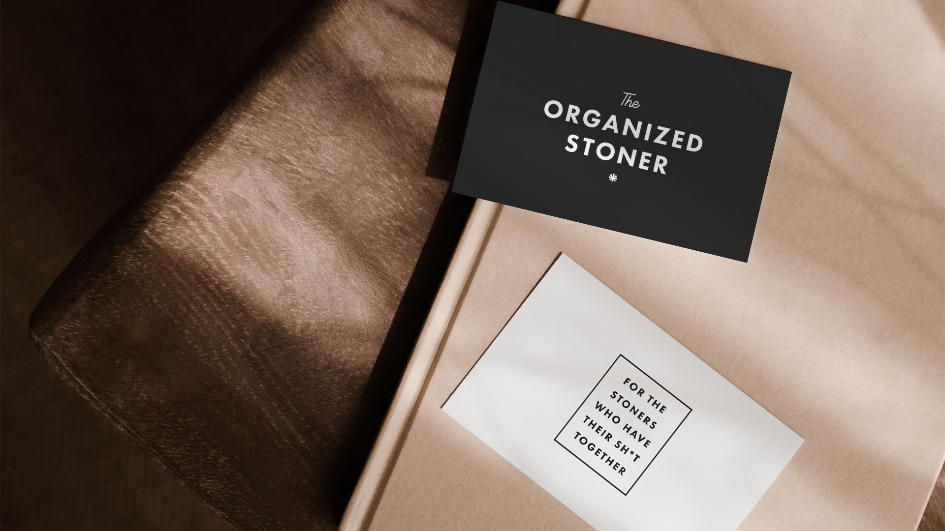
It became clear up-front that the ideal brand design should be minimal, modern, and a bit cheeky, incorporating subtle humor to show the brand doesn’t take itself too seriously. We chose a black-and-white color palette with mid-century design inspiration for a clever, approachable, yet mature (dare we say “organized”?) look and feel. Drawing inspiration from ‘60s-inspired typography and designs, the brand design plays on the brand’s humor, frequent use of swear words, and the products’ minimal, clean aesthetic.


The primary logo was custom-lettered for a completely unique look that is reminiscent of 1960’s script lettering. We chose script lettering for the primary logo to add a bit of flair and to juxtapose the modern, minimal feel of the brand with flourishes and curved lines.
We chose to design a suite of brand assets, knowing that our clients planned to invest in custom packaging and many other brand touchpoints where multiple design assets would add variety and interest to the brand experience.
The secondary logo, shown below, is designed as a minimal alternative to the primary logo and adds visual variety to the brand, showcasing the custom-designed hybrid illustration of a cannabis leaf / asterisk.


Shopify Website Development
After the visual identity design, we developed the brand into a custom website built on Shopify to market The Organized Stoner’s products to the right audience, including custom copywriting in the brand’s voice to bring the playful, tongue-in-cheek brand tone to life.
*As of August 2022, the website is still in final stages of development. This case study will be updated with a direct link once the full website is made public.


